What Makes an Image “On Brand”
"On brand" can be a slippery term. People use it all the time—but what does it actually mean? In our world, it means photos that not only look good, but also feel like an authentic extension of the brand they represent.
And what that looks like? It changes—a lot—depending on the industry.
For a graphic designer, "on brand" might mean clean lines, curated props, a strong color palette, and a subtle nod to their creative tools. It might mean negative space, thoughtful typography, or an eye-catching flat lay that mimics the way they work. For a food stylist or chef, it could look like movement, mess, or layered texture—cracked pepper, crumpled linen, and light catching in just the right spot on a glossy spoon. That’s their version of brand storytelling.
Interior designers often need photos that reflect not just the spaces they design, but the personality and values behind those spaces. Do their rooms feel warm and collected? Minimal and modern? Do they want their work to feel accessible, luxurious, or both? All of that shows up visually—and intentionally—in how we shoot.
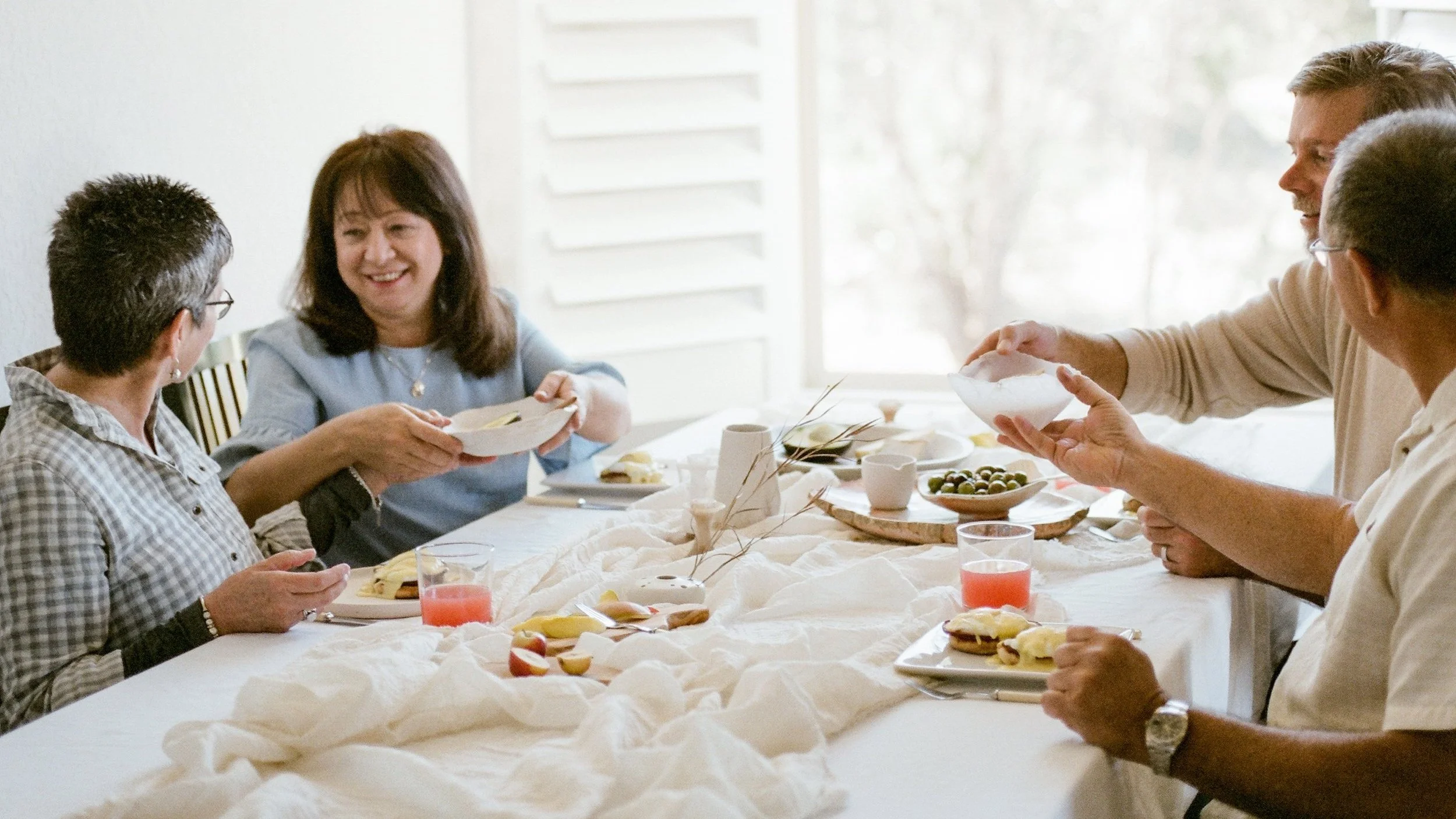
And then there are the clients who are the brand. Portraits become incredibly important here. The images need to speak to who they are, what they believe in, and who they want to reach. Whether that means confidence, calm, approachability, style, or something totally different—we shape the session to help them show up as their fullest self.
There’s no formula for this. No cookie-cutter. What makes a photo “on brand” is the thoughtful layering of visual choices that align with the heart of a business.
It’s why our process always begins with curiosity. Before the camera even comes out, we ask the right questions. That way, the final images feel like they came from the brand—not just made for it.